My work at an anti fake-news warriors company
Fake profiles are pumping the majority of fake news. It can easily skew people’s opinions, change elections, sabotage brands, politicians, and public figures. Cyabra detects social media attacks and translates them into insights, helping governments, intelligence and brands protect themselves against online disinformation threats or fake news.

Genesis
My first mission was to understand what problem we’re solving and for whom, our vision, metrics, and technical capabilities. I’ve created a notion wiki and filled it with insights from the founders and employees, then shared the results of this alignment. This helped us later on when re-architecting the platform.
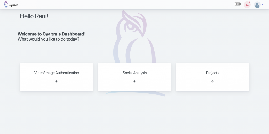
The current solution was built in patches and couldn’t scale smoothly for future development. The orientation was poor, and the error rate was high. We disassemble the platform to the core units, and by defining the new flows regarding the KPIs and business goals, we’ve reorganized it. The backend team took a big part in the process, enlighten us with insights (and blockers 😊) I translated the flows into concept screens, and the new layout was ready to be tested. The main focus was to simplify the workflow as most of the users weren’t tech-savvy and didn’t use the platform daily.
Exodus
While this change was crucial, I wanted to address our work with other stakeholders. At the very beginning, to create routine sync with marketing and sales, I initiated a bi-weekly GTM meeting that helped to share and get insights more holistically. I helped the marketing and analytics teams with our report builder restructure and design, aligning with the new facelift. We split the restructure into phases; each one focused on a different aspect of the platform.
- Layout – navigation and orientation.
- Add a new scan flow
- Widgets alignments and enhancement
Layout
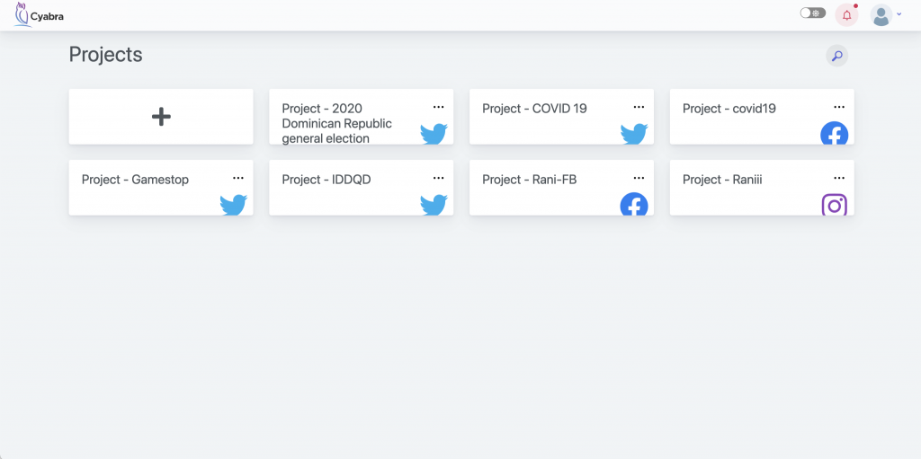
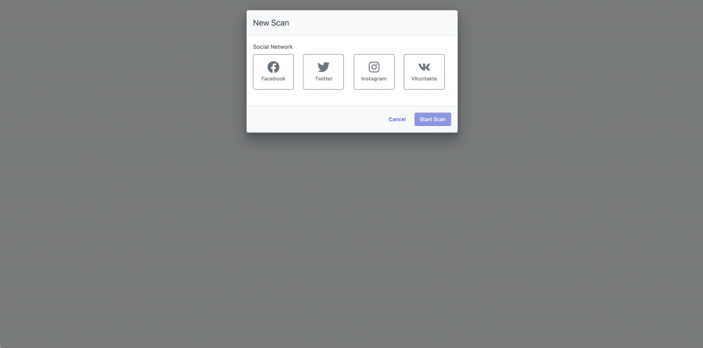
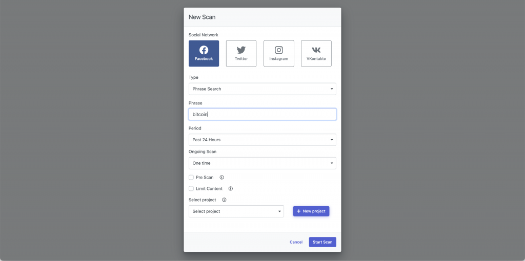
The main task was to simplify the main flows and orientation. The concept was simple – the main navigation bar and hidable filters bar. This makes the user fully understand where he is and what he can do – transparent and usability. Another way of simplifying was implemented on how the scans mechanism work. In the previous version, when a user wanted to scan a cross-platform phrase (“bitcoin” i.e) he needed to create a project of each platform (Facebook, Twitter, Instagram…) and a scan for each platform. It wasn’t intuitive and to add insult to injury – while presenting the data, each project was needed to be selected individually, casing a misunderstanding while the user thought all the data is being viewed while it wasn’t. Putting the filters as another layer of navigation and changing the backend to support a unified adding flow was a crucial addition.
New scan
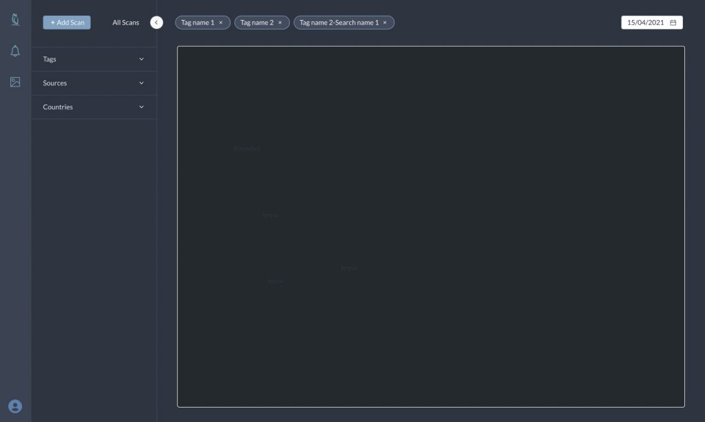
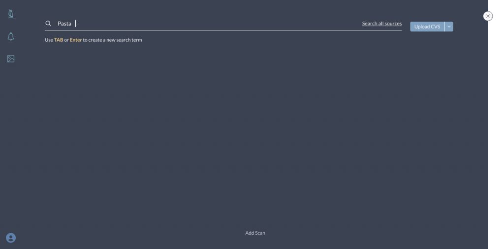
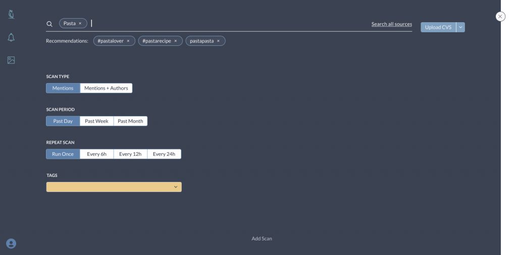
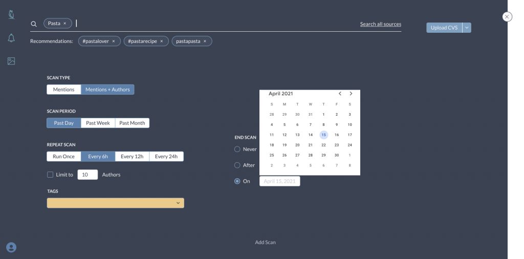
As mentioned earlier, it wasn’t easy for the user to understand how to create a new scan error-free. Each source (Social networks, news & discussions, IMs, etc.) had different settings which made the adding action even more complex. I’ve studied and understood each source’s uniqueness from the front and back aspects and found out that there’s a common ground in most of them and the rest of the settings can be aligned. Within a couple of sessions with my FE developer and product manager, we redefined the adding mechanism, to be a fully functioning flow.
Widget alignment
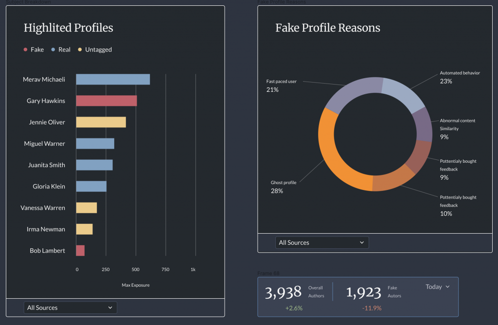
The holy grail of our platform is our data and the way we tell the story with it. Our analytic charts were implemented from different libraries causing a lack of alignment. In addition, the data source was limited only to one and this makes the storytelling not very fluent. In addition to the backend changes, we’ve made the widgets smarter, supporting all the sources for better decision-making. The redesign of the widgets took place by learning the CSS of the libraries and expanding within the capabilities of them. When the solution wasn’t enough I was looking for additional libraries that will fill the gap. The hover toolbox was also enhanced, with a better structure, additional relevant data and alignment with the visual concept.

